72個大廠UI視覺風格,一鍵複製生成界面
整理版優先睇
72個大廠視覺風格DESIGN.md文件,一鍵複製生成靚UI
呢篇文章由用戶體驗設計師陳婉寧分享,佢累積超過10年設計經驗同3年UIUX教學經驗。佢發現好多開發者、產品經理同老闆都想生成靚UI但冇設計基礎,所以佢整理咗72個知名大廠(例如Airbnb、Apple、Nike、Tesla等)嘅視覺風格DESIGN.md文件,配合Stitch工具,只需上傳文件再加一段提示詞,就可以一鍵生成對應風格嘅UI界面。作者想解決嘅問題係:點樣令冇設計背景嘅人都可以快速複製大廠級嘅視覺風格。整體結論係:透過結構化嘅設計規範文件(DESIGN.md)同AI工具嘅結合,可以大幅降低UI設計門檻,令非設計師都可以產出專業級界面。
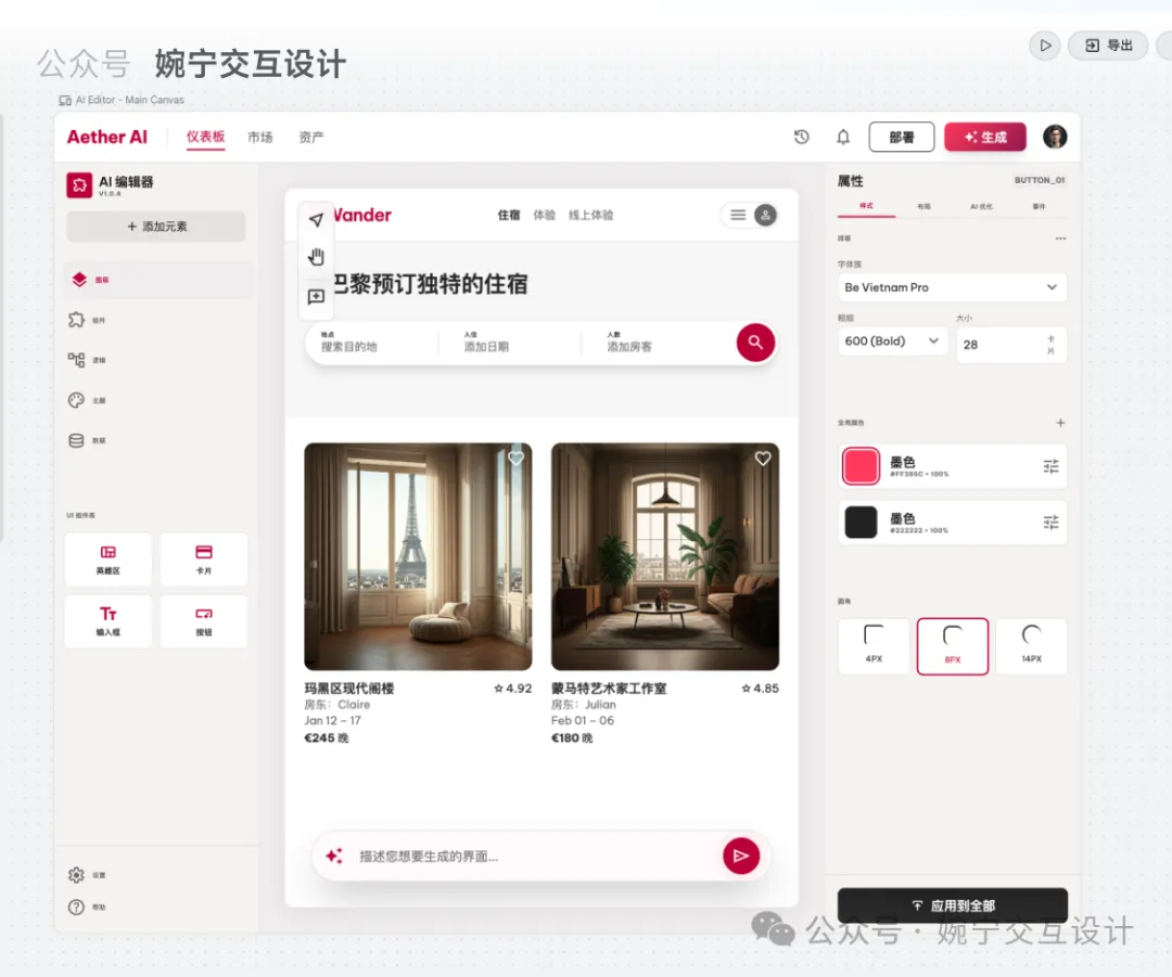
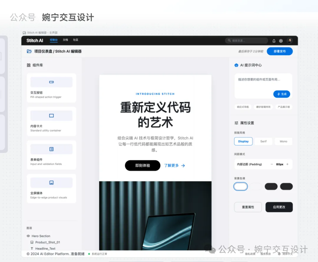
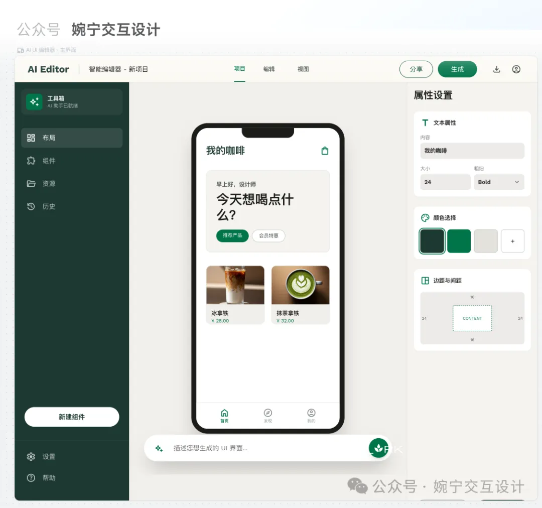
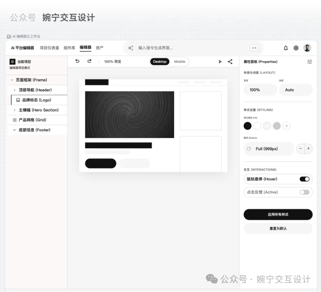
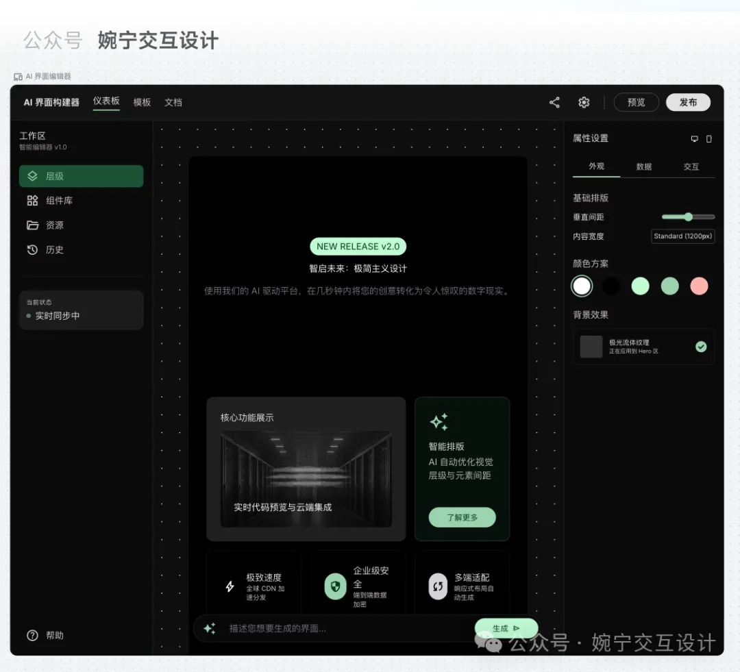
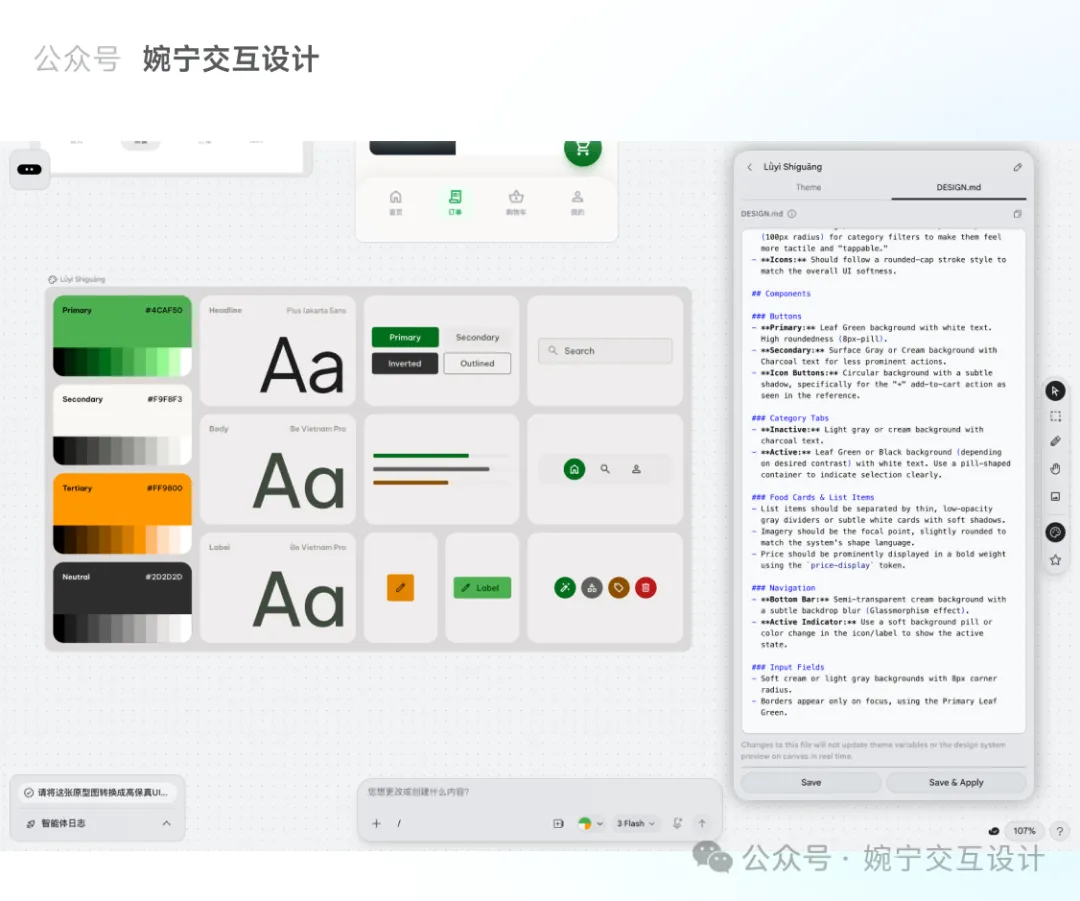
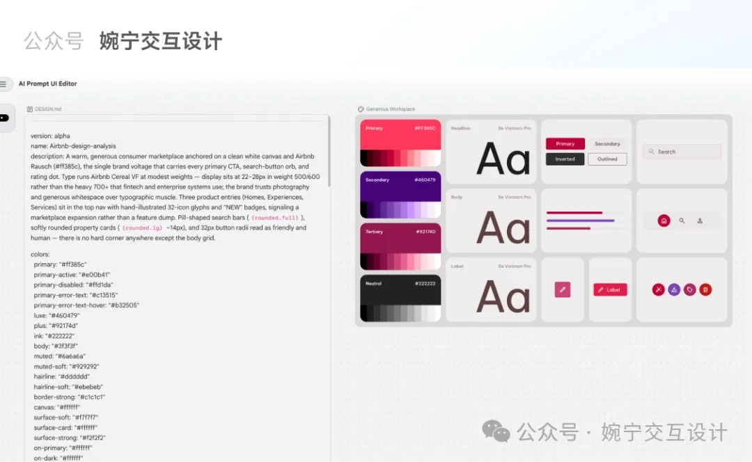
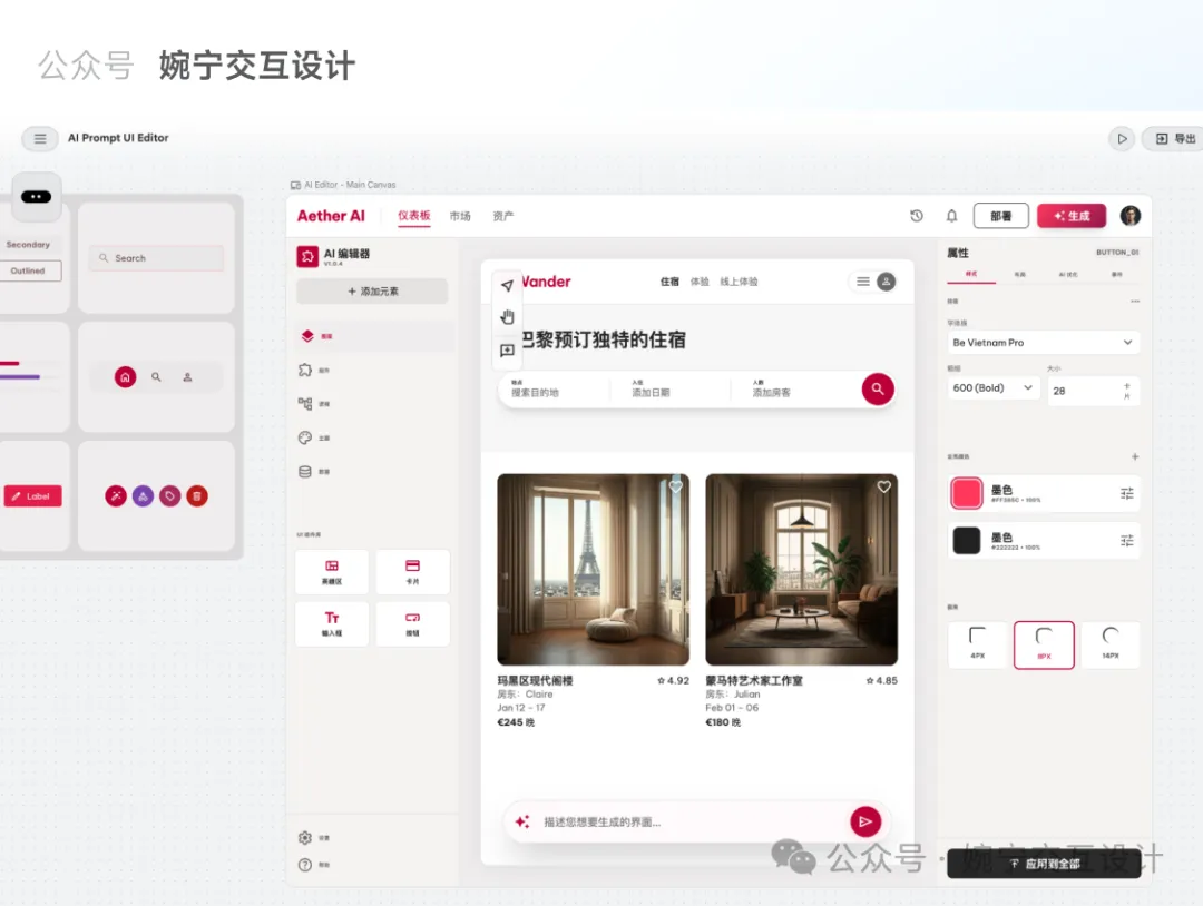
DESIGN.md係Google Stitch嘅核心功能,本質係一個純文字設計規範文檔,包含名稱、顏色、字體、圓角、間距、組件等定義。文章展示咗一個範例,例如顏色primary係綠色,字體用Plus Jakarta Sans等。呢啲規範可以精準控制UI生成效果,比起純粹用prompt更穩定同還原。作者免費提供呢72個風格文件,只需掃碼或加微信(wanning2755)即可領取。
文章仲提到Stitch嘅操作流程:喺右上角點擊「+以您的設計為基礎」,將DESIGN.md文件拖入,然後輸入提示詞,系統會先生成對應嘅視覺規範,再生成界面。如果想換風格,只需替換文件即可。呢種方法適合快速原型、產品演示同內部工具開發。總括而言,呢篇文章提供咗一個實用嘅AI+設計規範工作流,令即使唔識設…
- 結論:72個知名大廠風格嘅DESIGN.md文件可一鍵生成對應UI,極大降低設計門檻。
- 方法:喺Stitch上傳DESIGN.md文件,輸入提示詞,系統自動生成視覺規範同界面。
- 差異:DESIGN.md係結構化設計規範,比普通prompt更精準、穩定,還原度更高。
- 啟發:非設計師都可以藉助呢類「設計規範+AI工具」嘅組合產出專業級UI,適合快速原型。
- 可行動點:免費領取72個DESIGN.md文件(掃碼或加微信wanning2755),並喺Stitch嘗試生成不同風格。
冇設計基礎?呢個方法幫你生成大廠風格UI
好多開發者、產品經理同老闆都問我,如果冇設計基礎,點樣先可以生成靚UI?
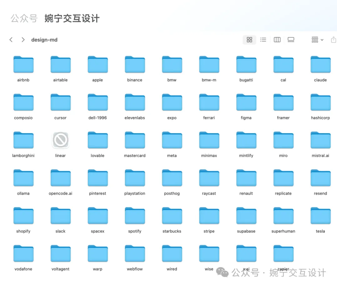
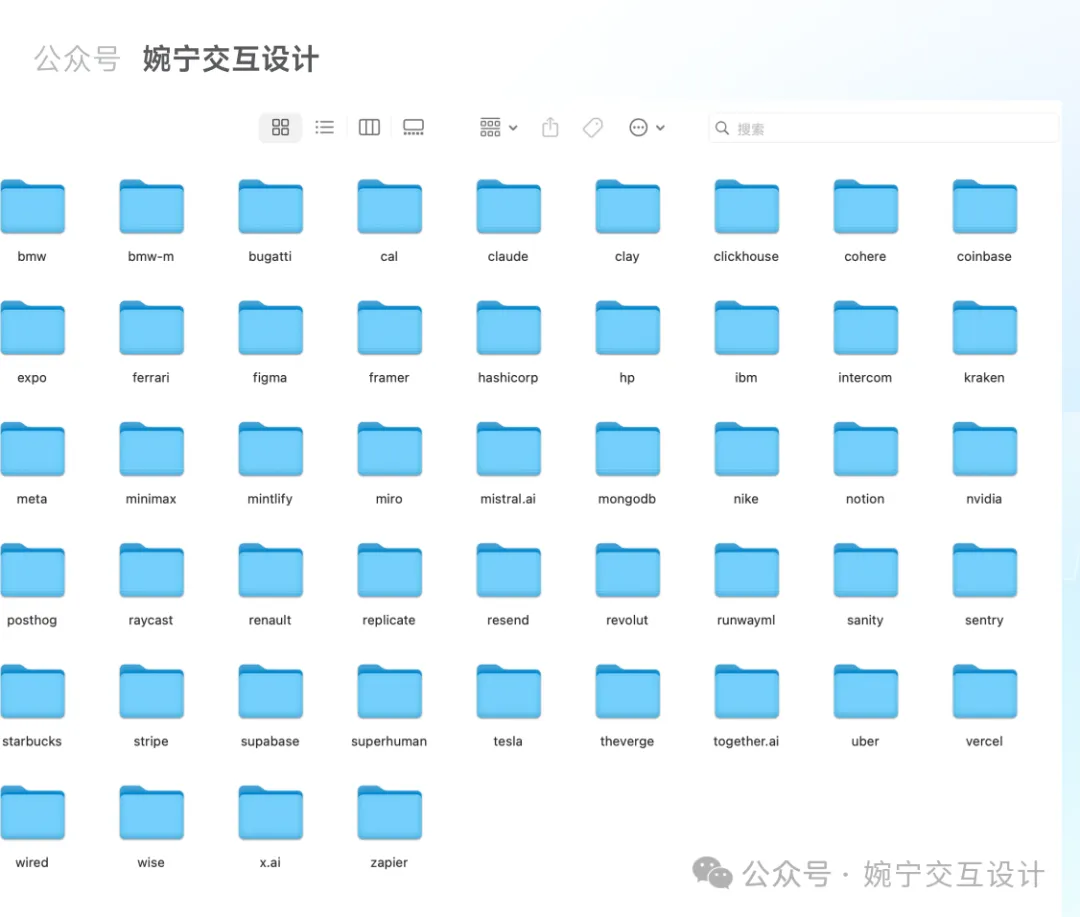
我整理咗72個知名大廠嘅視覺風格DESIGN.md文件,例如Airbnb、Apple、Starbucks、Nike、Tesla等,只要輸入提示詞,就可以直接生成對應風格嘅UI界面。
下圖係低代碼AI平台編輯器頁面嘅效果:Airbnb風格、Apple蘋果極簡風格、星巴克咖啡風格、Nike風格、shopify風格、tesla特斯拉風格、uber風格。
Airbnb風格
Apple蘋果極簡風格
星巴克咖啡風格
Nike風格
Tesla特斯拉風格
DESIGN.md 係乜?
DESIGN.md係Google Stitch嘅核心功能之一,本質係一個純文字文檔,用嚟定義AI創作UI界面時嘅設計樣式規範。
Google Stitch核心功能
name: Lǜyì Shíguāng
colors:
 primary: '#006e1c'
 secondary: '#5e5f5b'
typography:
 headline-xl:
 fontFamily: Plus Jakarta Sans
 fontSize: 24px
 fontWeight: '700'
 lineHeight: 32px
rounded:
 sm: 0.25rem
 DEFAULT: 0.5rem
 md: 0.75rem
spacing:
 unit: 4px
 xs: 4px
---
Brand & Style
The visual identity...
## Colors
- Primary (Leaf Green): Used for primary buttons...
## Typography
This design system employs...
## Layout & Spacing
The design system utilizes...DESIGN.md令你可以精準控制UI生成效果,無論顏色、字體定係組件風格,都可以一一對應。
精準控制UI生成效果
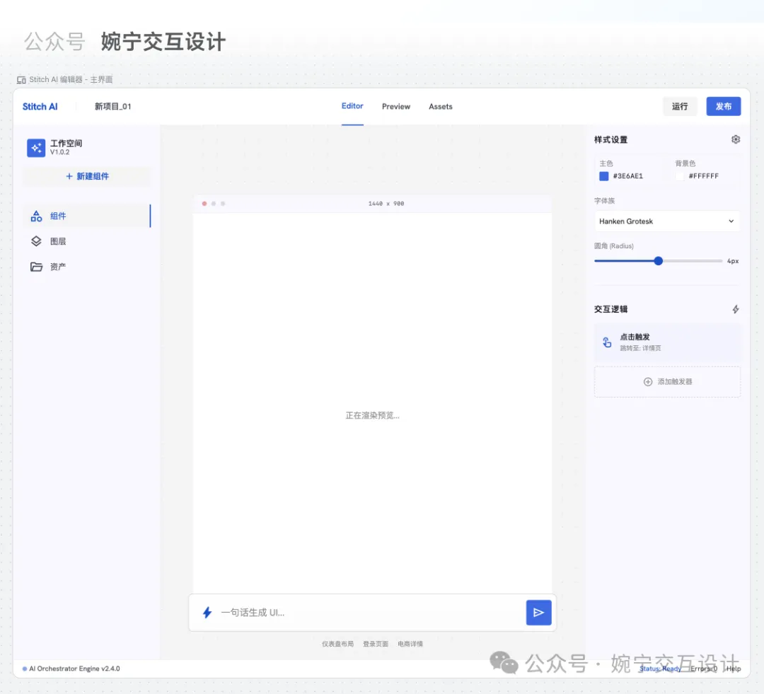
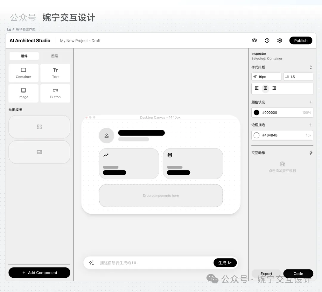
點樣用Stitch生成界面?
喺Stitch工具入面,操作好簡單,跟住以下步驟就得:
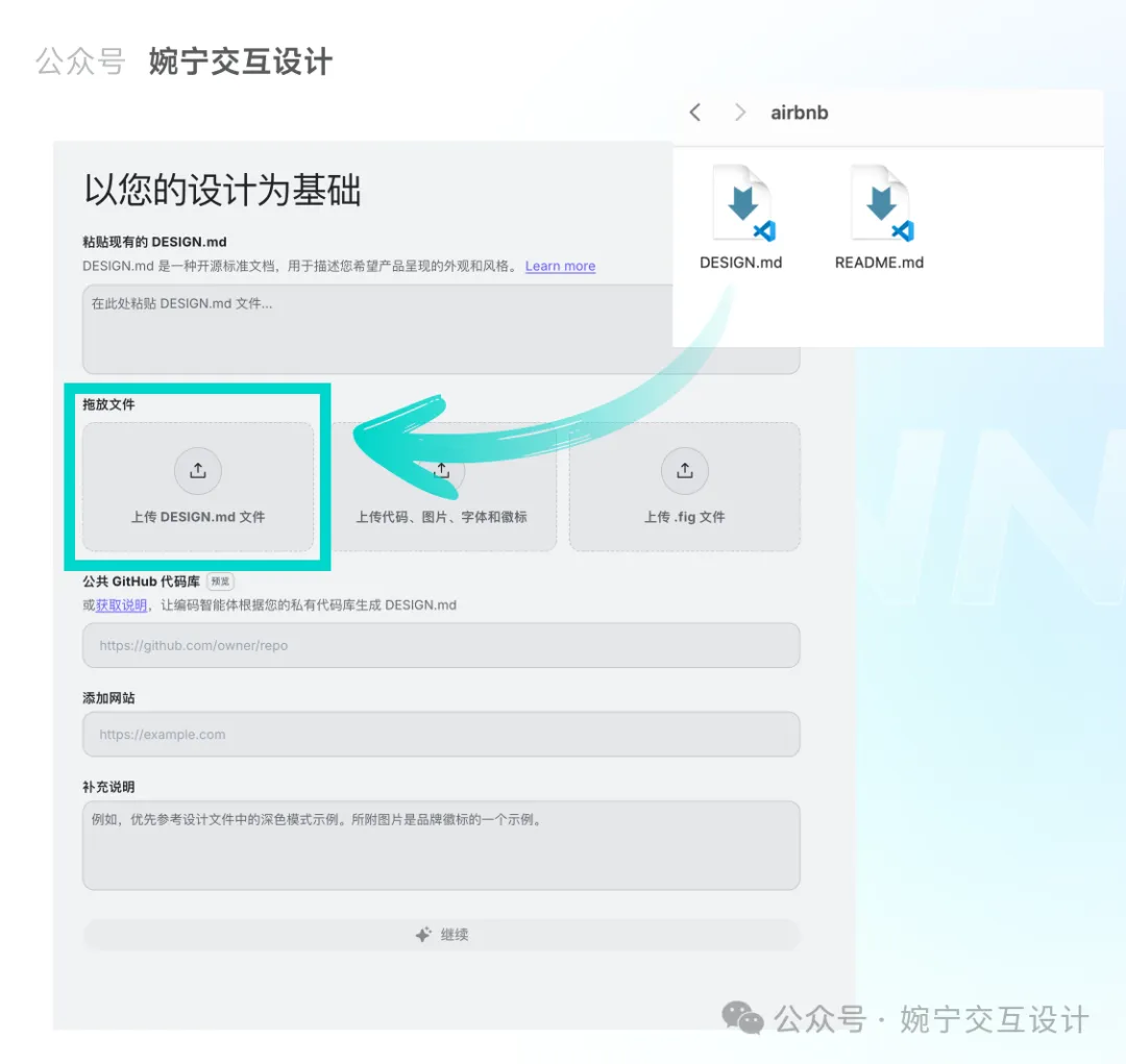
- 1 喺Stitch右上角點擊「+以您的設計為基礎」按鈕。
- 2 將對應風格文件夾入面嘅DESIGN.md文件拖拽入去,然後點擊「繼續」。
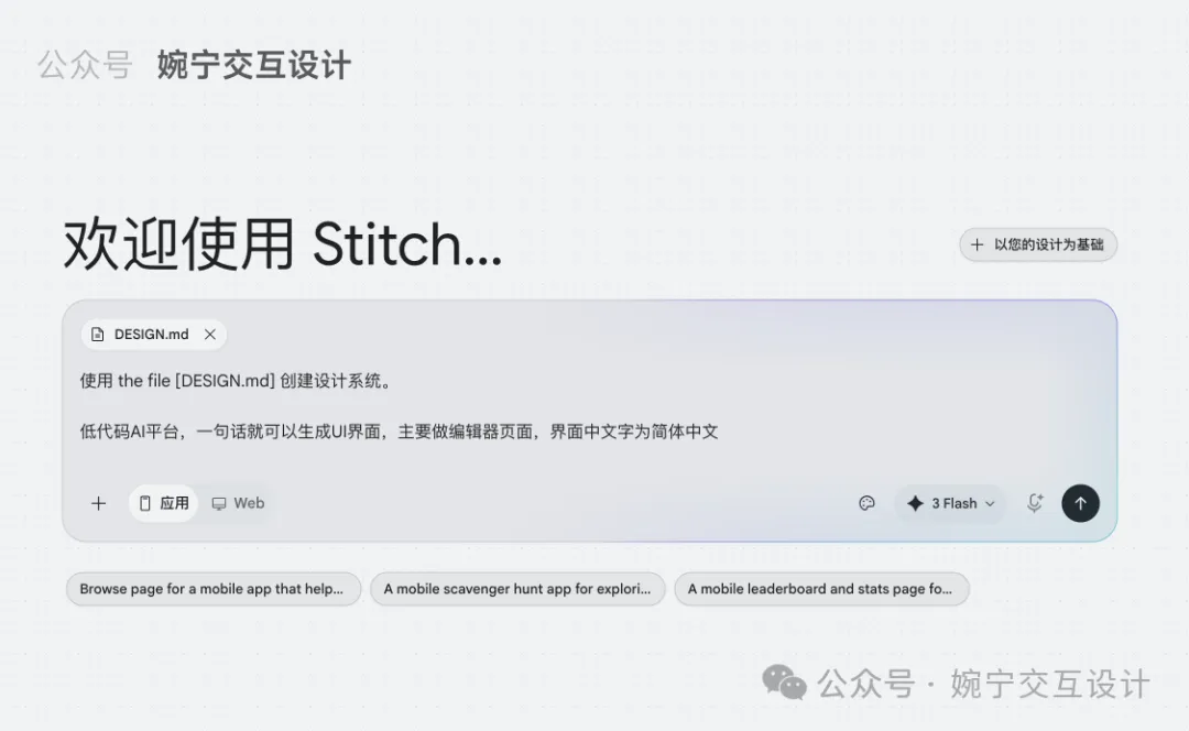
- 3 輸入提示詞,例如「生成Airbnb風格嘅UI界面」。
- 4 系統會先根據DESIGN.md生成對應嘅視覺規範,再生成界面。
- 5 如果想換風格,只需重新上傳另一個風格嘅DESIGN.md文件即可。
拖拽DESIGN.md文件到Stitch
輸入提示詞
成個過程唔使幾分鐘,就可以快速產出大廠風格嘅界面原型。
免費拎72個風格文件
呢72個風格文件涵蓋曬知名大廠,包括Cursor、Lovable、Framer、Figma、Miro、Slack、Claude、Notion、BMW、Meta等等。
Cursor、Lovable、Framer、Figma、Miro、Slack、Claude、Notion、BMW、Meta
全部免費,唔收費分享!掃下面QR Code或加微信 wanning2755 就可以拎。
掃QR Code或加微信 wanning2755
作者陳婉寧係德國交互設計專業留學5年,用戶體驗設計師,深耕設計領域10年+,UIUX設計教學經驗3年+。持續沉澱UIUX設計類文章200+,歡迎交流。
陳婉寧
10年+設計經驗
Airbnb風格
Apple蘋果極簡風格
星巴克咖啡風格
Nike風格
shopify風格
tesla特斯拉風格
uber風
咩係DESIGN.md?
name: Lǜyì Shíguāng
colors:
 primary: '#006e1c'
 secondary: '#5e5f5b'

typography:
 headline-xl:
 fontFamily: Plus Jakarta Sans
 fontSize: 24px
 fontWeight: '700'
 lineHeight: 32px

rounded:
 sm: 0.25rem
 DEFAULT: 0.5rem
 md: 0.75rem

spacing:
 unit: 4px
 xs: 4px

---

Brand & StyleThe visual identity of this design system is built upon the concept of "Vibrant Vitality." It aims to evoke a sense of freshness, transparency, and holistic well-being. The target audience includes health-conscious urban professionals who value quality ingredients and a premium, frictionless ordering experience.The design style follows a Modern / Corporate aesthetic with strong Minimalist influences. It prioritizes clarity and appetite appeal through high-quality food photography set against a clean, spacious interface. The use of soft shadows and generous whitespace creates an approachable, premium atmosphere that feels lighter and more "organic" than traditional utility-focused delivery apps.## ColorsThe color palette is anchored by a vibrant Leaf Green, used strategically to highlight healthy choices and primary actions. To differentiate from the harsh whites of standard apps, a soft Cream background is utilized to create a warmer, more "organic" paper-like feel.- Primary (Leaf Green): Used for primary buttons, selection states, and health indicators.- Secondary (Cream): The main background color to provide a soft, appetizing canvas.- Tertiary (Carrot Orange): Reserved for accents such as "New" tags, ratings, or limited-time discounts.- Neutral (Charcoal): Used for primary text to ensure high readability without the harshness of pure black.- Surface Gray: A subtle light gray for borders and secondary button backgrounds to maintain a clean hierarchy.## TypographyThis design system employs a pairing of Plus Jakarta Sans for headlines and Be Vietnam Pro for body text. This combination offers a friendly, modern, and highly legible experience.Headlines use a bolder weight to establish a clear hierarchy, while body text remains light and airy to prevent visual clutter. For numerical data such as pricing and nutritional information, Plus Jakarta Sans provides a clean, geometric look that feels precise yet approachable. Hierarchy is maintained through size and weight variance rather than excessive color changes.## Layout & SpacingThe design system utilizes a Fluid Grid layout optimized for mobile-first interactions. It follows a 4px baseline grid to ensure consistent vertical rhythm. Content is housed within a central container with 20px side margins to provide breathing room. Vertical spacing between different sections (e.g., Category Tabs and Item Lists) should be generous (24px or 32px) to emphasize the "clean" brand personality. Elements within a card or list item follow a tighter spacing (8px to 16px) to maintain grouping.### Buttons- Primary: Leaf Green background with white text. High roundedness (8px-pill).- Secondary: Surface Gray or Cream background with Charcoal text for less prominent actions.- Icon Buttons: Circular background with a subtle shadow, specifically for the "+" add-to-cart action as seen in the reference.### Category Tabs- Inactive: Light gray or cream background with charcoal text.- Active: Leaf Green or Black background (depending on desired contrast) with white text. Use a pill-shaped container to indicate selection clearly.### Food Cards & List Items- List items should be separated by thin, low-opacity gray dividers or subtle white cards with soft shadows.- Imagery should be the focal point, slightly rounded to match the system's shape language.- Price should be prominently displayed in a bold weight using the price-display token.### Navigation- Bottom Bar: Semi-transparent cream background with a subtle backdrop blur (Glassmorphism effect).- Active Indicator: Use a soft background pill or color change in the icon/label to show the active state.### Input Fields- Soft cream or light gray backgrounds with 8px corner radius.- Borders appear only on focus, using the Primary Leaf Green.
如何使用DESIGN.md製作不同視覺風格的UI界面?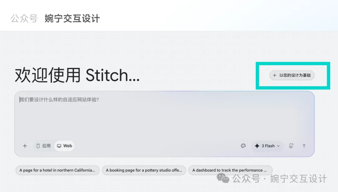

That's all.
我係陳婉寧,德國交互設計專業留學5年,用戶體驗設計師,深耕設計領域10年+,UIUX設計教學經驗3年+。
持續累積UIUX設計類文章200+,朋友圈每日持續分享uiux設計領域乾貨知識,希望用自己嘅設計經驗陪大家一路過關!
歡迎加我:wanning2755
Airbnb風格
Apple蘋果極簡風格
星巴克咖啡風格
Nike風格
shopify風格
tesla特斯拉風格
uber風
什麼是DESIGN.md?
name: Lǜyì Shíguāng
colors:
 primary: '#006e1c'
 secondary: '#5e5f5b'

typography:
 headline-xl:
 fontFamily: Plus Jakarta Sans
 fontSize: 24px
 fontWeight: '700'
 lineHeight: 32px

rounded:
 sm: 0.25rem
 DEFAULT: 0.5rem
 md: 0.75rem

spacing:
 unit: 4px
 xs: 4px

---

Brand & StyleThe visual identity of this design system is built upon the concept of "Vibrant Vitality." It aims to evoke a sense of freshness, transparency, and holistic well-being. The target audience includes health-conscious urban professionals who value quality ingredients and a premium, frictionless ordering experience.The design style follows a Modern / Corporate aesthetic with strong Minimalist influences. It prioritizes clarity and appetite appeal through high-quality food photography set against a clean, spacious interface. The use of soft shadows and generous whitespace creates an approachable, premium atmosphere that feels lighter and more "organic" than traditional utility-focused delivery apps.## ColorsThe color palette is anchored by a vibrant Leaf Green, used strategically to highlight healthy choices and primary actions. To differentiate from the harsh whites of standard apps, a soft Cream background is utilized to create a warmer, more "organic" paper-like feel.- Primary (Leaf Green): Used for primary buttons, selection states, and health indicators.- Secondary (Cream): The main background color to provide a soft, appetizing canvas.- Tertiary (Carrot Orange): Reserved for accents such as "New" tags, ratings, or limited-time discounts.- Neutral (Charcoal): Used for primary text to ensure high readability without the harshness of pure black.- Surface Gray: A subtle light gray for borders and secondary button backgrounds to maintain a clean hierarchy.## TypographyThis design system employs a pairing of Plus Jakarta Sans for headlines and Be Vietnam Pro for body text. This combination offers a friendly, modern, and highly legible experience.Headlines use a bolder weight to establish a clear hierarchy, while body text remains light and airy to prevent visual clutter. For numerical data such as pricing and nutritional information, Plus Jakarta Sans provides a clean, geometric look that feels precise yet approachable. Hierarchy is maintained through size and weight variance rather than excessive color changes.## Layout & SpacingThe design system utilizes a Fluid Grid layout optimized for mobile-first interactions. It follows a 4px baseline grid to ensure consistent vertical rhythm. Content is housed within a central container with 20px side margins to provide breathing room. Vertical spacing between different sections (e.g., Category Tabs and Item Lists) should be generous (24px or 32px) to emphasize the "clean" brand personality. Elements within a card or list item follow a tighter spacing (8px to 16px) to maintain grouping.### Buttons- Primary: Leaf Green background with white text. High roundedness (8px-pill).- Secondary: Surface Gray or Cream background with Charcoal text for less prominent actions.- Icon Buttons: Circular background with a subtle shadow, specifically for the "+" add-to-cart action as seen in the reference.### Category Tabs- Inactive: Light gray or cream background with charcoal text.- Active: Leaf Green or Black background (depending on desired contrast) with white text. Use a pill-shaped container to indicate selection clearly.### Food Cards & List Items- List items should be separated by thin, low-opacity gray dividers or subtle white cards with soft shadows.- Imagery should be the focal point, slightly rounded to match the system's shape language.- Price should be prominently displayed in a bold weight using the price-display token.### Navigation- Bottom Bar: Semi-transparent cream background with a subtle backdrop blur (Glassmorphism effect).- Active Indicator: Use a soft background pill or color change in the icon/label to show the active state.### Input Fields- Soft cream or light gray backgrounds with 8px corner radius.- Borders appear only on focus, using the Primary Leaf Green.
如何使用DESIGN.md製作不同視覺風格的UI界面?That's all.
我是陳婉寧,德國交互設計專業留學5年,用戶體驗設計師,深耕設計領域10年+,UIUX設計教學經驗3年+ 。
持續沉澱UIUX設計類文章200+,朋友圈每日持續分享uiux設計領域乾貨知識,希望用自己的設計經驗陪你們一路闖關!
歡迎加我:wanning2755